
Painting (2018)
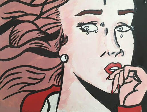
Homage to Roy Lichtenstein's Crying Girl, Monochromatic - 2018 - Oil on panel - 12 inches x 16 inches
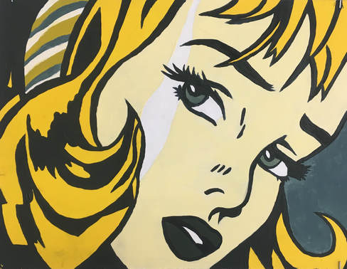
Homage to Roy Lichtenstein's Girl with Hair Ribbon, Analogous - 2018 - Oil on panel - 12 inches x 16 inches
|
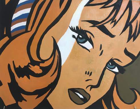
Homage to Roy Lichtenstein's Girl with Hair Ribbon, Complementary - 2018 - Oil on panel - 12 inches x 16 inches
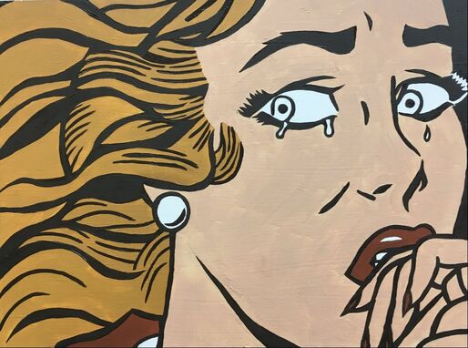
Homage to Roy Lichtenstein's Crying Girl, Earth Tones - 2018 - Oil on panel - 12 inches x 16 inches
|
Assignment: 4 Part Color Study
The monochromatic painting was the first part of these paintings I did. I've worked with oil paints before, but not in this style. I chose Roy Lichtenstein because I really enjoy and am inspired by the Pop Art movement. This project, I wanted to focus on the color and contrast, both of which I can sometimes struggle with in my personal art. As I went, I ended up getting better at my handling of oil paints. The proportions of the faces, the precision of the lines, and the opacity of the shapes slowly progressed through these four pieces.
For the monochromatic piece, I chose cadmium red because I wanted it to have more of a loving feel. When I first looked at Lichtenstein's Crying Girl piece, I always thought of the story as one after a loss, whether that be loss of a friend or lover. To me, red is a very intense color, and so is love. It's a very intense emotion that can completely control a person, and even debilitate them. For the complementary piece, I chose blue and orange as my complements because I really wanted to include bright blue eyes. To me, bright blue eyes are very piercing to the soul, but they are very calming because of the way we think about the sky and ocean. They are open and peaceful, and I wanted to have that feel in this piece.
For the analogous piece, I chose yellow-green, yellow, and blue-green. I don't use these colors all that often because of how vibrant they are. I think they make a very conflicted piece because the yellow and yellow-green is so happy, but the blue-green makes it more somber. For the earth tones, I wanted to create a more realistic, closer-to-the-original piece. I I only wish I had changed the white paint to be a bit more gray.
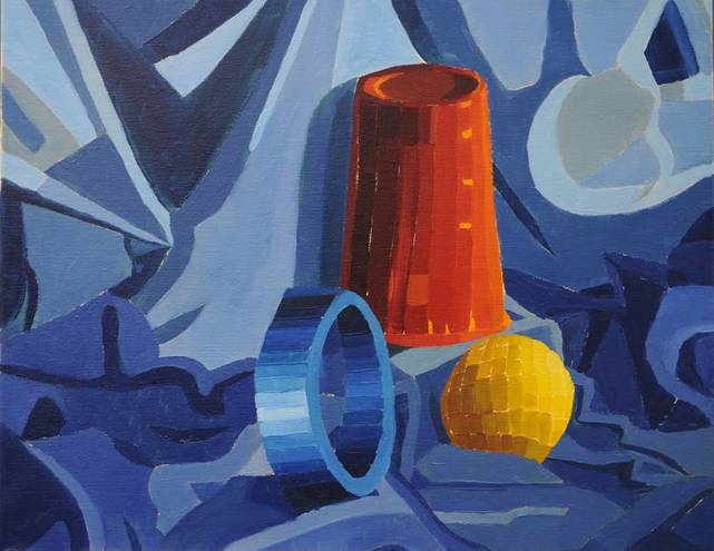
Triad - 2018 - Oil on canvas - 16 inches x 20 inches
Assignment: Planar Still Life
For this piece, I really wanted the objects to play off of the folds surrounding them. I wanted the folds to be more abstract and almost 2D than the objects. I focused on color and shape because I felt these were important in order to create movement and emphasis. For this piece, I wanted the background to make the objects pop out without focusing too much on the folds.
For this piece, I really wanted the objects to play off of the folds surrounding them. I wanted the folds to be more abstract and almost 2D than the objects. I focused on color and shape because I felt these were important in order to create movement and emphasis. For this piece, I wanted the background to make the objects pop out without focusing too much on the folds.
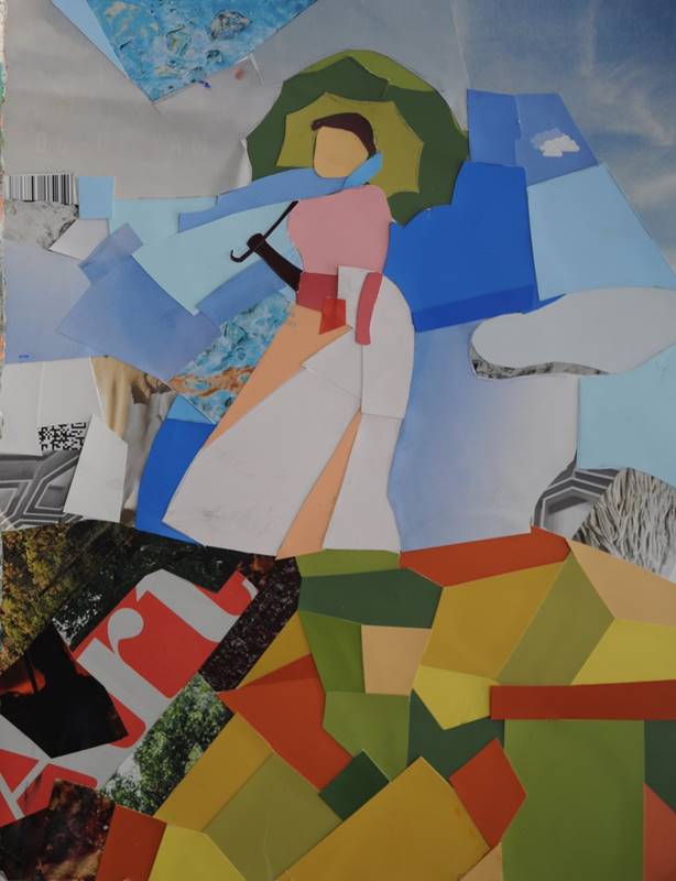
Homage to Claude Monet's Woman with a Parasol Facing Left - 2018 - Cut paint samples and magazine on paper - 11 inches x 14 inches
|
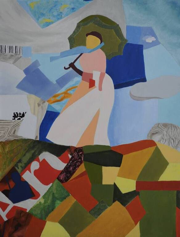
Homage to Claude Monet's Woman with a Parasol Facing Left #2 - 2018 - Oil on canvas - 30 inches x 40 inches
|
Assignment: Collage and Realistic Painting of Collage
For this piece, I wanted to work with a more hectic, colorful piece since I had previously been inspired by pop artists. I also wanted to put a modern twist on it, with a bit of a meta "Art", QR code, and bar code. I also combined both magazine and paint sample pieces to get a variety of rough and smooth textures to get me out of my comfort zone. The different color varieties in each section were made and placed strategically in order to represent brushstrokes that Monet used.
For this piece, I wanted to work with a more hectic, colorful piece since I had previously been inspired by pop artists. I also wanted to put a modern twist on it, with a bit of a meta "Art", QR code, and bar code. I also combined both magazine and paint sample pieces to get a variety of rough and smooth textures to get me out of my comfort zone. The different color varieties in each section were made and placed strategically in order to represent brushstrokes that Monet used.
Just a Little Off.. - 2018 - Oil on canvas - 24 inches x 36 inches
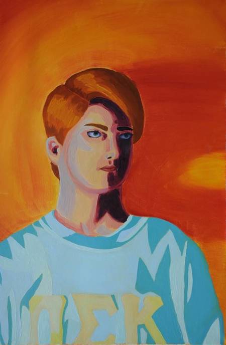
Assignment: Planar Self-Portrait
This piece is accurately named "Just a Little Off.." because, unintentionally, I made the eyes and proportions just slightly off. Furthermore, the colors are just a bit too vibrant to make this any kind of realistic. So, this is a testament to how we look at ourselves and think that certain things are just "not right". We are very self-conscious about our appearances, so we notice these small things much more than others do. I wanted to make it more fun and colorful, not only to get me out of my comfort zone and have fun with it, but also to say that accepting and being proud of what we see as our flaws can be very empowering and uplifting.
This piece is accurately named "Just a Little Off.." because, unintentionally, I made the eyes and proportions just slightly off. Furthermore, the colors are just a bit too vibrant to make this any kind of realistic. So, this is a testament to how we look at ourselves and think that certain things are just "not right". We are very self-conscious about our appearances, so we notice these small things much more than others do. I wanted to make it more fun and colorful, not only to get me out of my comfort zone and have fun with it, but also to say that accepting and being proud of what we see as our flaws can be very empowering and uplifting.
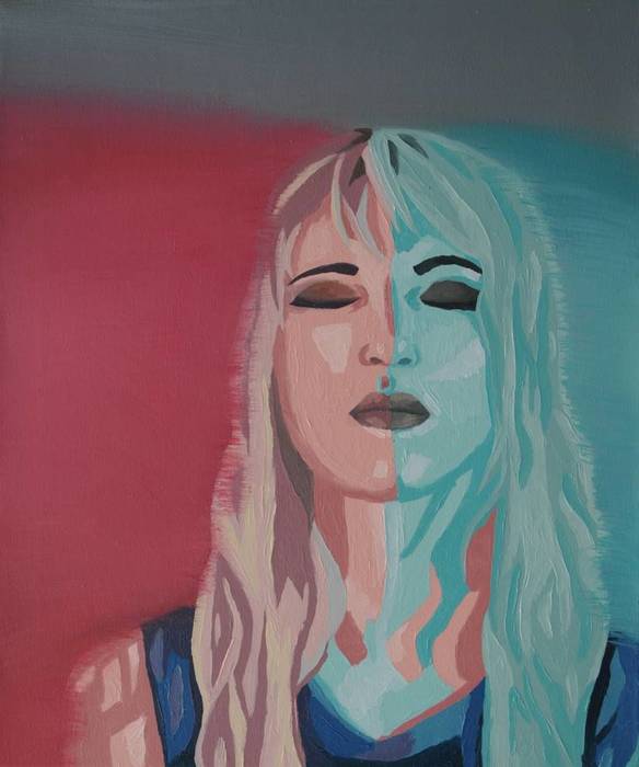
Conflicting Acceptance (Hayley Williams of Paramore) - 2018 - Oil on handmade canvas - 20 inches x 24 inches
Assignment: Final Painting
This piece has been most fun for me because I let my accuracy and precision of lines go, if only slightly. I found this picture of Hayley Williams and fell in love with the complementary red and green colors. Immediately, I resonated with what this piece could mean for me. To me, these colors both work together and conflict with each other. To me, I reflect this relationship in my own personality, thoughts, opinions, value, beliefs, etc. I think as people, we are very conflicting. Our hearts and minds are in a constant battle of the "smart" thing to do versus the risky thing that will make us happy. We want to be safe, but we want to be happy, and sometimes these things are not one and the same action. The purpose of the fuzziness on the outside of this portrait was to represent a sense of acceptance of this conflict, but notice that it is not completely overpowering. We must accept our conflicts, but work with it in order for it to not lead our life.
This piece has been most fun for me because I let my accuracy and precision of lines go, if only slightly. I found this picture of Hayley Williams and fell in love with the complementary red and green colors. Immediately, I resonated with what this piece could mean for me. To me, these colors both work together and conflict with each other. To me, I reflect this relationship in my own personality, thoughts, opinions, value, beliefs, etc. I think as people, we are very conflicting. Our hearts and minds are in a constant battle of the "smart" thing to do versus the risky thing that will make us happy. We want to be safe, but we want to be happy, and sometimes these things are not one and the same action. The purpose of the fuzziness on the outside of this portrait was to represent a sense of acceptance of this conflict, but notice that it is not completely overpowering. We must accept our conflicts, but work with it in order for it to not lead our life.
